
Color along with form are the essence of any work of art. The Post-Impressionist painter Maurice Denis stated – “ Remember, that a picture, before it is a picture of a battle horse, …a portrait, or some story, is essentially a flat surface covered in colors arranged in a certain order.” This is true in any era, though the Modern artists influenced by innovators like Piet Mondrian and developments of the revolutionary German art school The Bauhaus took these principals to an extreme. Works displayed in the Art Space stem from these Modernist ideas focusing on design, color and form as well as how artists use color to support their intended narratives. As you spend time with these artworks consider how color can affect your mood and perception. We hope this space inspires you to look, imagine and create your own works of art.
LEON POLK SMITH (AMERICAN, 1906–1996)
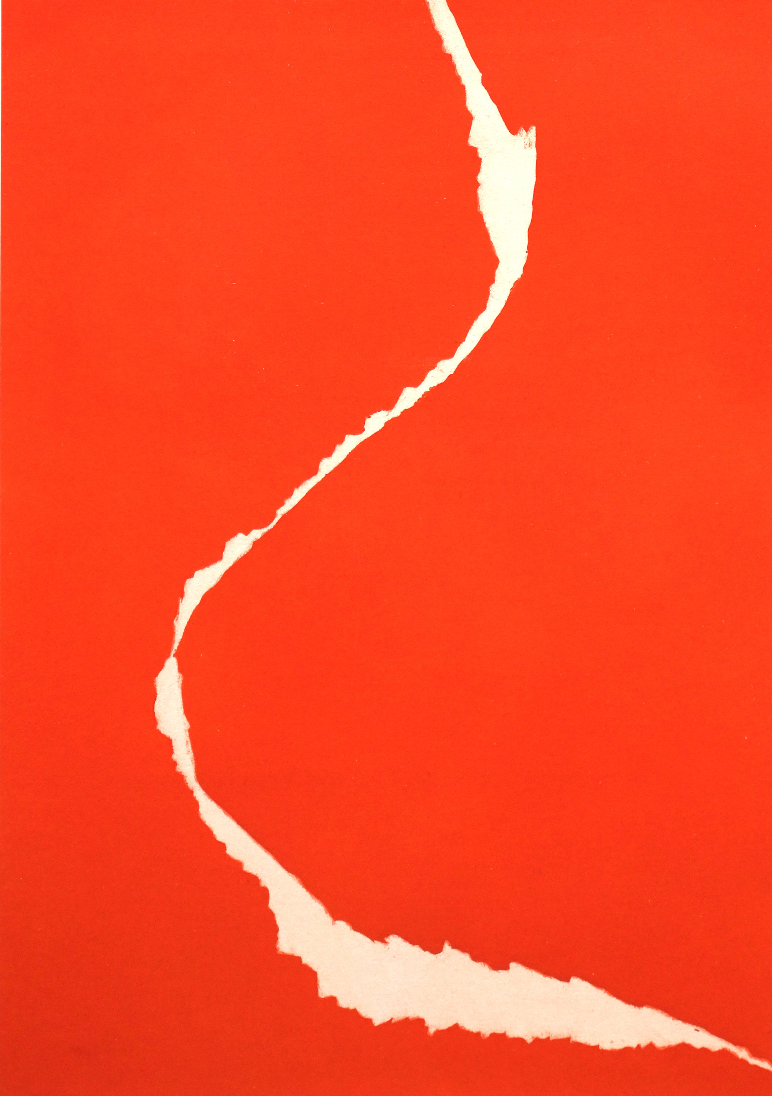
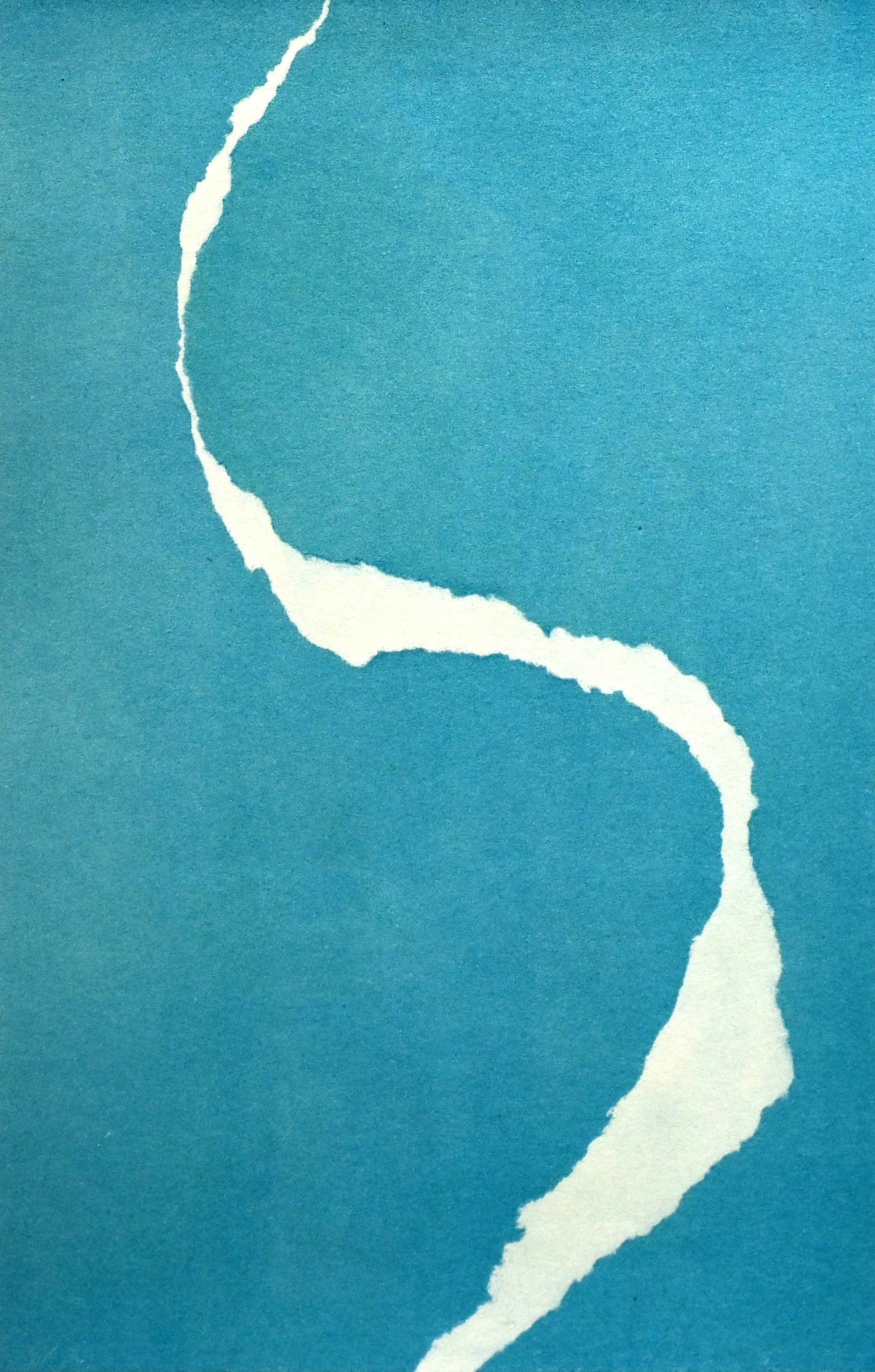
Leon Polk Smith was one of the foremost pioneers of the minimalist movement and transformed American painting with his hard-edged forms and bold colors. Smith was born in the American Indian territory of Chickasha, Oklahoma, in 1906. He was of Cherokee descent, and his parents instilled in him the concept of equality in an era marked by racism. In 1936, Smith graduated from Oklahoma State College and later that year moved to New York where he began his Master’s degree in Art Education at Columbia University. While in New York, one of his professors took him to see the neoplastic paintings of Piet Mondrian and the revolutionary sculptures of Constantin Brâncuși and Jean Arp. While inspired by these modern artists, he would later go far beyond their rigid philosophies by employing new forms to create his monumental works. In this series of prints Leon Polk Smith started each piece as a torn paper drawing or collage to create a suite of lithographs. Each piece is an individual in color and form, yet collectively they relate to each other as a harmonious whole. The artist chose to begin with a very simple but brilliant idea – arranging deliberately torn pieces of colored paper on a white background.
MACK STEWART (AMERICAN, 1946—2008)
Mack Stewart was an exceptional painter best known for his non-objective and painterly abstractions. He was also a part of the Area Arts Foundation founded by Dord Fitz. This painting, Flight Formation, was included in AMoA’s 2008 Achievement in Art exhibition honoring the Area Arts Foundation.
Flight Formation at first glance seems simple yet is deceivingly complex. In an ensemble of color patches, Stewart utilizes multiple color schemes while keeping the same hue of light blue a constant. It is intriguing to see how the blue appears to change in relation to its surrounding colors – whether it’s next to yellow, orange, or green. Stewart is illuminating the theory of Simultaneous Contrast, which is when two colors side by side change our perception accordingly. We usually don’t see colors isolated, a hue’s brightness or intensity and value can appear different next to surrounding colors.

MACK STEWART, (American, 1946—2008), Flight Formation, 1981, Oil on canvas, Gift of the Area Arts Foundation in honor of Dord Fitz, one of its founders, by his students who made this gift possible as citizens of the High Plains

WARREN DAVIS (AMERICAN, 1932–1974)
Warren Davis was born in Amarillo, TX, in 1932. Davis studied at the University of Texas and at Oklahoma State University before arriving at his unique aesthetic under the guidance of Amarillo artist and gallerist Dord Fitz. Beginning in 1962, he lived and worked in New York City, where he achieved critical and commercial success. Relocating to Tesuque, New Mexico, in 1971, he continued to paint steadily and intensely until his premature passing in 1974.
In the estimation of Elaine de Kooning, “Davis’ work has always been remarkably consistent, expressing a sense of wholeness and clarity, of tension within tranquility – no loose ends, no raw colors, no indecisiveness.” Marked by a serene extravagance and rigorously controlled gesture, the paintings of Warren Davis achieve a startling balance between brilliant hues and icy darks to create a form of unimpeded expression manifest in broad curtains of astounding chromatic complexity.
Most of Davis’ canvases are simply titled Untitled. The content of the painting for Davis was in the making of it. Looking at this painting, we see the buildup of an image that’s form has been excavated out of colors being mixed directly on the canvas. In terms of color, we see a cascade of beautifully tinted neutrals. In painting, this is called chromatic grays. Not the gray mixed with black and white but grays filled with traces of color. Most colors are made by mixing the primaries, red, yellow, and blue.